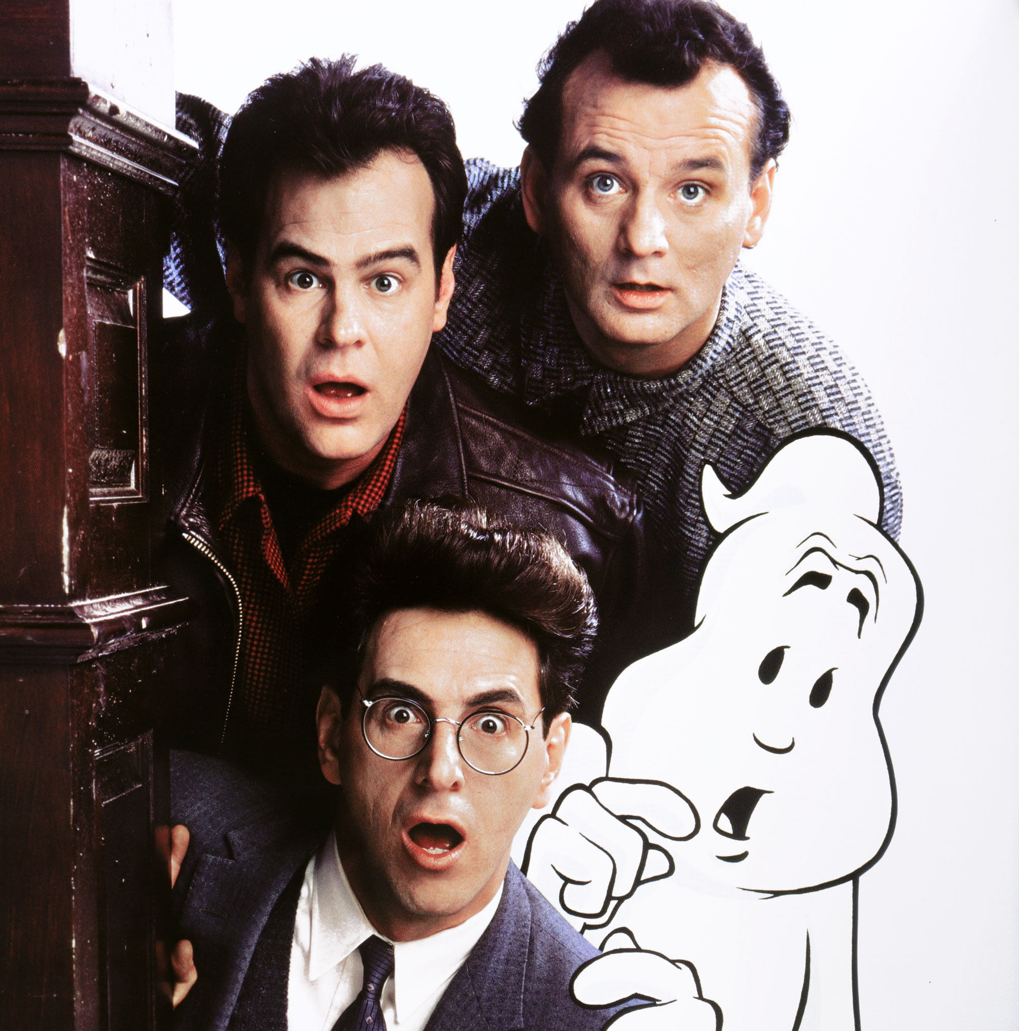
It’s Ghostbusters Day! What better time to take a closer look at one of the film’s most enduring pieces of imagery – the famous No-Ghost logo – and to salute this unassuming but hugely influential movie design gem.
The word ‘iconic’ is probably thrown around a little more freely than it should be. But there can be no doubting that the Ghostbusters logo is truly an icon in the history of film graphics. From its use in the 1984 film itself to its huge popularity on t-shirts and countless other items of merchandise ever since, the No-Ghost logo has become firmly embedded in our popular cultural heritage.
Even viewed in isolation, with the movie title nowhere in sight, this classic insignia, with its cartoon ghost trapped behind but reaching through a bold red ‘no’ sign, is instantly recognisable. This simple graphic conjures up all things Ghostbusters – classic moments from the film, the catchiest of theme tunes, and some seriously evocative childhood memories for 1980s kids like me.
The magic of the No-Ghost sign is in the tone it sets. We all know that the ghouls that terrorise the citizens of New York in Ghostbusters are at times downright terrifying. But this is brilliantly offset by the movie’s deft wit and playfulness. And this comic element is reflected perfectly in the logo. The ghost (given the name Mooglie during the making of the movie) has a mischievous rather than overtly menacing look. This fun but not excessively cute figure, with the strong graphic impact of the red circle and slash of the ‘no’ symbol, makes for a playful and thoroughly memorable design.
Where it all began
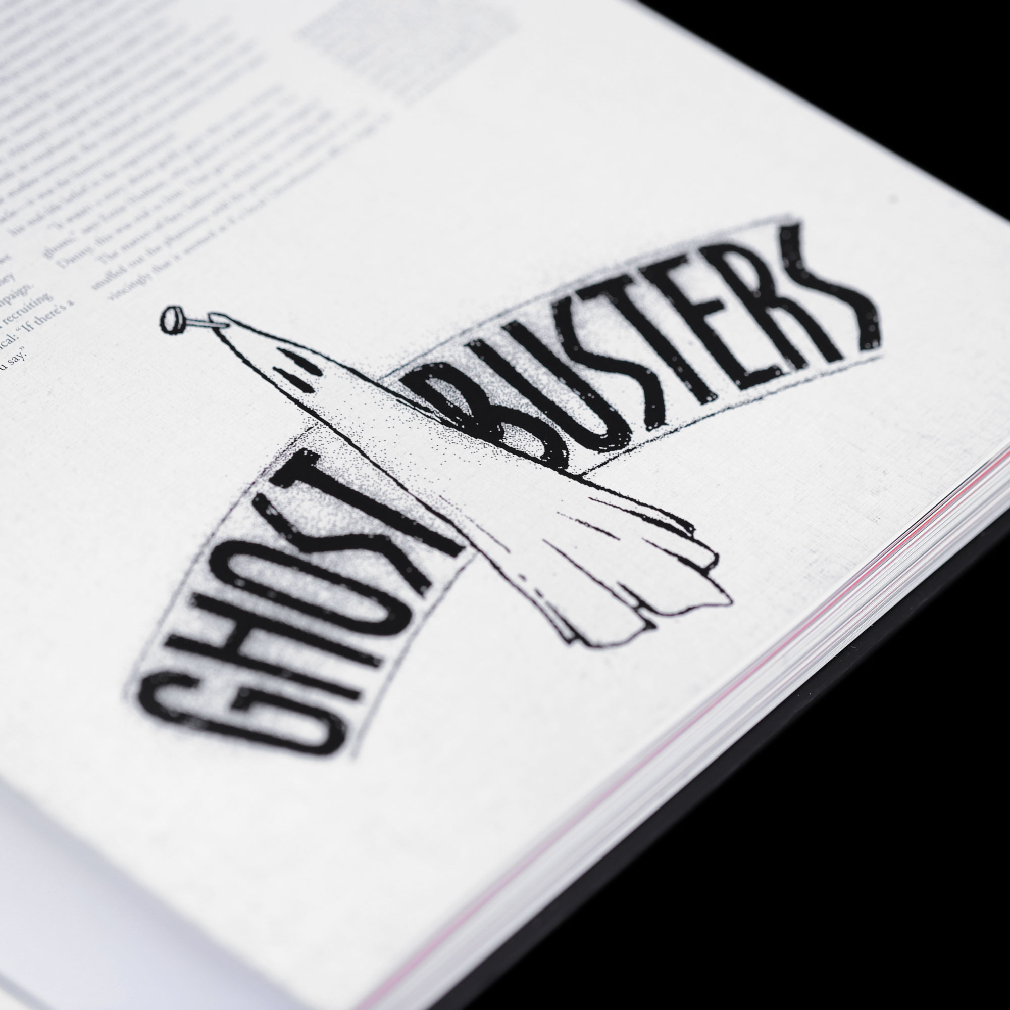
The origins of the logo can be traced back to a script for an early manifestation of the Ghostbusters idea from its creator Dan Aykroyd, known as Ghost Smashers. This is where the concept of a ghost inside a ‘no’ sign is thought to have first appeared.
This idea was developed into its final form for the 1984 Ghostbusters movie by Michael C Gross, a graphic designer and one of the film’s associate producers. With additional input from Brent Boates, an artist working on visual concepts for the movie, the legendary logo was born.
Curiously, while the main logo used in the movie has its diagonal line running from top right to bottom left, there is another version in which the line runs the opposite way. This is because in the international ‘no’ symbol (officially called the general prohibition sign) the red bar runs instead from top left to bottom right. This form of the logo was mostly used in Europe, where the use of the ‘no’ sign is more familiar in daily life.
Alternative versions
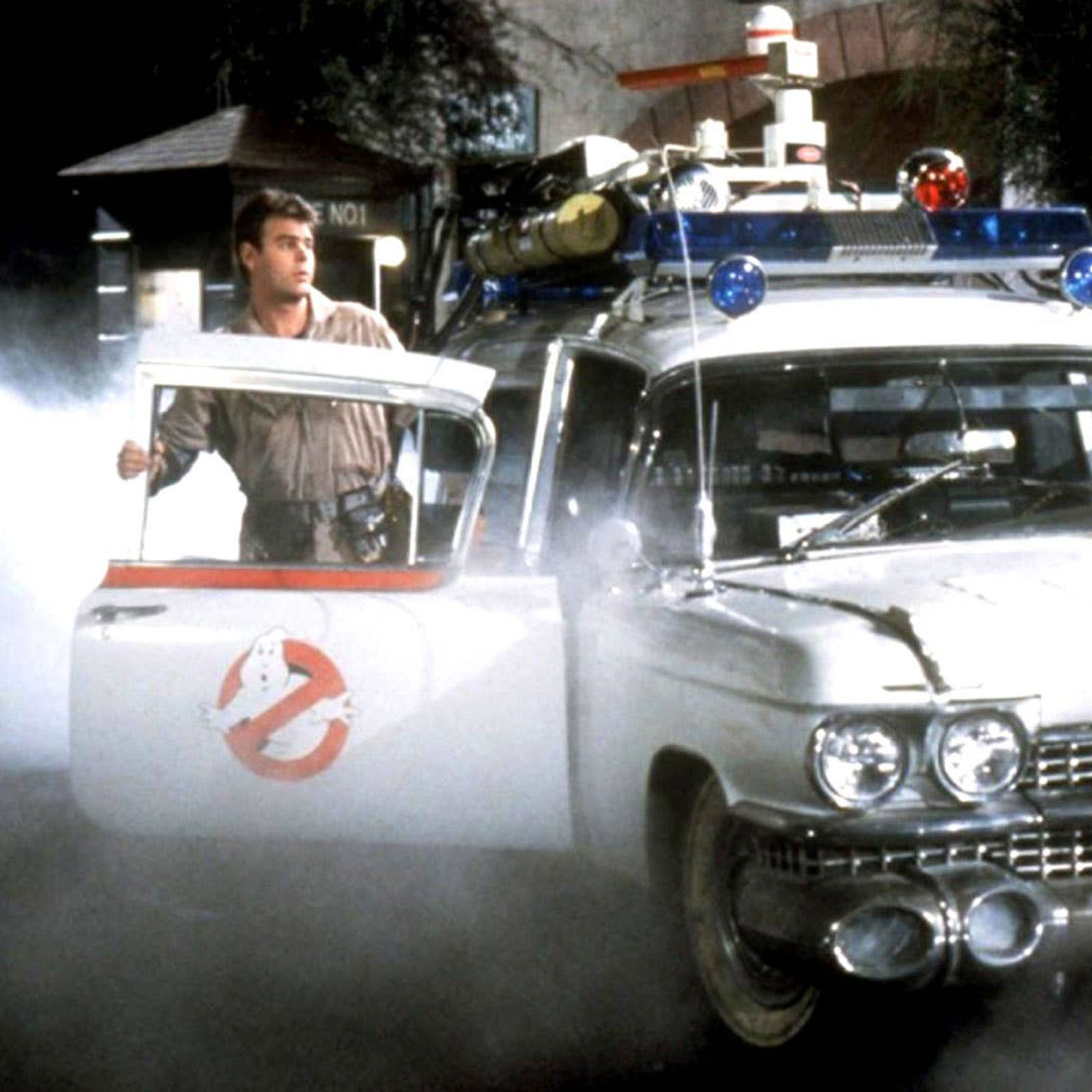
Even for what we know as the definitive version of the logo, there are two slight variations of it, with subtle design differences. One, in which Mooglie’s hand is more smoothly curved, is clearly visible for the first time in the scene where the Ecto-1 stops outside of the Sedgewick Hotel in the original 1984 Ghostbusters.
A more familiar version of the logo, where Mooglie’s hands take a slightly different form, can be seen on the Ecto-1 at the start of Ghostbusters II and in Ghostbusters: Afterlife and has been adopted as the main logo used on all official Ghostbusters marketing materials and merchandise.
These considerations were crucial when creating my Door Transfer and Sticker Kits mod for the Hero Collector 1:8 Ecto-1 model. The main objective was to correct the scale (those provided were too big) and to provide a higher-quality finish. But I also aimed for maximum authenticity and, as there’s no right or wrong answer to the question of which of the two variations to apply to the model, I offered both. (My personal preference is undoubtedly the Sedgewick Hotel version, which transports me to that thrilling first moment of seeing the Ecto-1 in action.)
Between two worlds
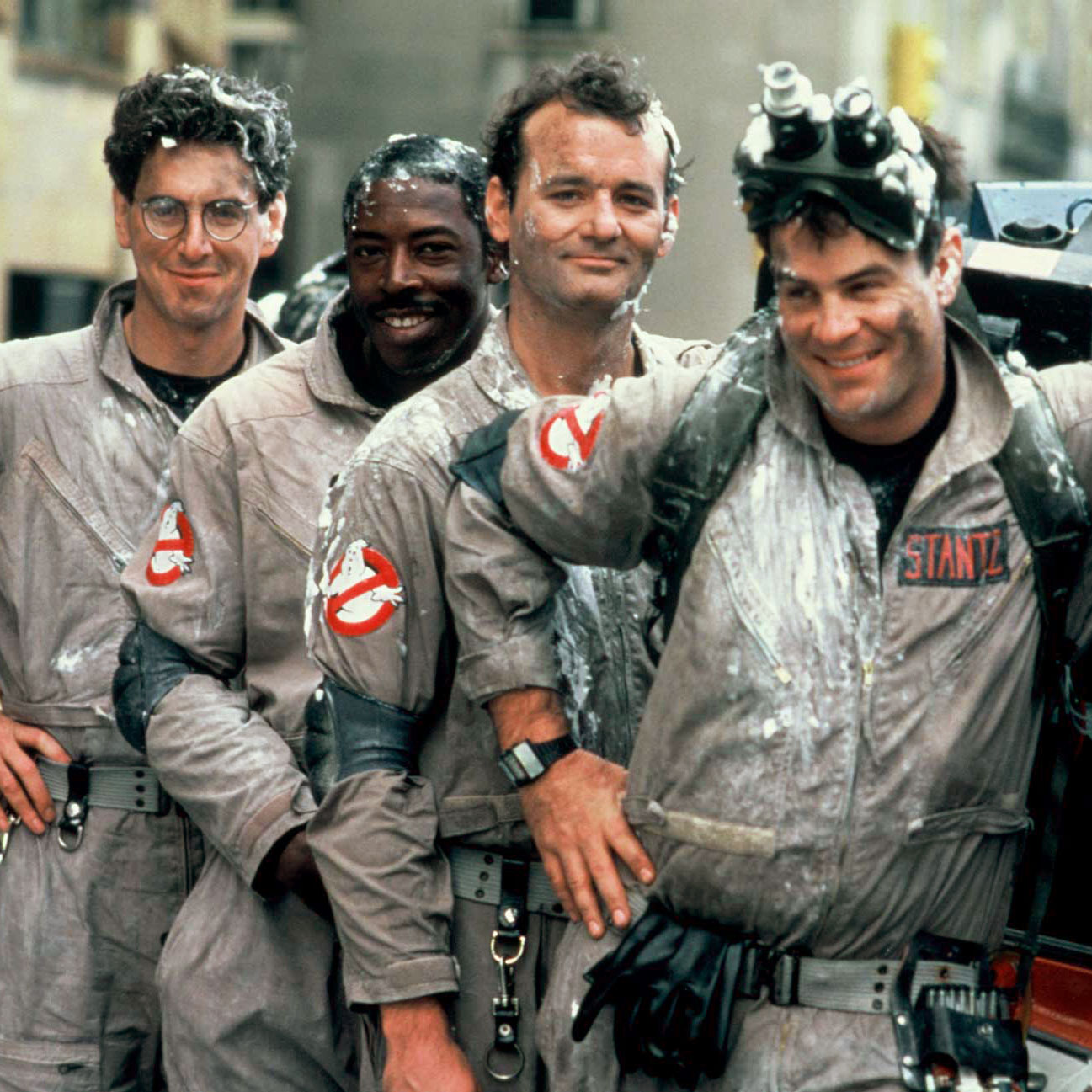
One thing that makes the use of the No-Ghost logo special is that it exists both within the internal world of the Ghostbusters movie itself (as the business logo for the ghost catching enterprise) and outside this as the logo representing the film in the real world. Fans of obscure trivia might be interested to know that this makes the film’s logo a ‘diagetic’ element – meaning it forms part of the fictional story itself.
This curiosity is lost in the choice of logo for the Ghostbusters II movie. This design, featuring a smiling Mooglie who holds up two fingers to indicate a sequel, wouldn’t exist in the Ghostbusters world itself and so loses its diagetic quality. It was a relief for many to see the original logo restored when Ghostbusters: Afterlife was released some three decades later.
The classic No-Ghost logo is firmly cemented as an essential piece of film history. From its enduring connection with those of us who love Ghostbusters to its important role in the visual imagery in scenes of the movie, it has a remarkable legacy.
Nowhere does the logo make its presence felt more strongly than in the branding of the Ghostbusters’ all-important work vehicle, the Ectomobile. This makes the Door Transfer and Sticker Kits I have created for the Hero Collector Ecto-1 such a key mod for me. If you’re building this model, I hope you enjoy the enhanced quality and realism this addition brings – a fitting tribute to the ‘No-Ghost’ sign, a cool and much-loved piece of movie iconography.

It’s Ghostbusters Day! What better time to take a closer look at one of the film’s most enduring pieces of imagery – the famous No-Ghost logo – and to salute this unassuming but hugely influential movie design gem.
The word ‘iconic’ is probably thrown around a little more freely than it should be. But there can be no doubting that the Ghostbusters logo is truly an icon in the history of film graphics. From its use in the 1984 film itself to its huge popularity on t-shirts and countless other items of merchandise ever since, the No-Ghost logo has become firmly embedded in our popular cultural heritage.
Even viewed in isolation, with the movie title nowhere in sight, this classic insignia, with its cartoon ghost trapped behind but reaching through a bold red ‘no’ sign, is instantly recognisable. This simple graphic conjures up all things Ghostbusters – classic moments from the film, the catchiest of theme tunes, and some seriously evocative childhood memories for 1980s kids like me.
The magic of the No-Ghost sign is in the tone it sets. We all know that the ghouls that terrorise the citizens of New York in Ghostbusters are at times downright terrifying. But this is brilliantly offset by the movie’s deft wit and playfulness. And this comic element is reflected perfectly in the logo. The ghost (given the name Mooglie during the making of the movie) has a mischievous rather than overtly menacing look. This fun but not excessively cute figure, with the strong graphic impact of the red circle and slash of the ‘no’ symbol, makes for a playful and thoroughly memorable design.
Where it all began
The origins of the logo can be traced back to a script for an early manifestation of the Ghostbusters idea from its creator Dan Aykroyd, known as Ghost Smashers. This is where the concept of a ghost inside a ‘no’ sign is thought to have first appeared.
This idea was developed into its final form for the 1984 Ghostbusters movie by Michael C Gross, a graphic designer and one of the film’s associate producers. With additional input from Brent Boates, an artist working on visual concepts for the movie, the legendary logo was born.
Curiously, while the main logo used in the movie has its diagonal line running from top right to bottom left, there is another version in which the line runs the opposite way. This is because in the international ‘no’ symbol (officially called the general prohibition sign) the red bar runs instead from top left to bottom right. This form of the logo was mostly used in Europe, where the use of the ‘no’ sign is more familiar in daily life.


Alternative versions
Even for what we know as the definitive version of the logo, there are two slight variations of it, with subtle design differences. One, in which Mooglie’s hand is more smoothly curved, is clearly visible for the first time in the scene where the Ecto-1 stops outside of the Sedgewick Hotel in the original 1984 Ghostbusters.
A more familiar version of the logo, where Mooglie’s hands take a slightly different form, can be seen on the Ecto-1 at the start of Ghostbusters II and in Ghostbusters: Afterlife and has been adopted as the main logo used on all official Ghostbusters marketing materials and merchandise.
These considerations were crucial when creating my Door Transfer and Sticker Kits mod for the Hero Collector 1:8 Ecto-1 model. The main objective was to correct the scale (those provided were too big) and to provide a higher-quality finish. But I also aimed for maximum authenticity and, as there’s no right or wrong answer to the question of which of the two variations to apply to the model, I offered both. (My personal preference is undoubtedly the Sedgewick Hotel version, which transports me to that thrilling first moment of seeing the Ecto-1 in action.)
Between two worlds
One thing that makes the use of the No-Ghost logo special is that it exists both within the internal world of the Ghostbusters movie itself (as the business logo for the ghost catching enterprise) and outside this as the logo representing the film in the real world. Fans of obscure trivia might be interested to know that this makes the film’s logo a ‘diagetic’ element – meaning it forms part of the fictional story itself.
This curiosity is lost in the choice of logo for the Ghostbusters II movie. This design, featuring a smiling Mooglie who holds up two fingers to indicate a sequel, wouldn’t exist in the Ghostbusters world itself and so loses its diagetic quality. It was a relief for many to see the original logo restored when Ghostbusters: Afterlife was released some three decades later.
The classic No-Ghost logo is firmly cemented as an essential piece of film history. From its enduring connection with those of us who love Ghostbusters to its important role in the visual imagery in scenes of the movie, it has a remarkable legacy.
Nowhere does the logo make its presence felt more strongly than in the branding of the Ghostbusters’ all-important work vehicle, the Ectomobile. This makes the Door Transfer and Sticker Kits I have created for the Hero Collector Ecto-1 such a key mod for me. If you’re building this model, I hope you enjoy the enhanced quality and realism this addition brings – a fitting tribute to the ‘No-Ghost’ sign, a cool and much-loved piece of movie iconography.

1 Reply on Capturing the spirit of Ghostbusters – the story behind the No-Ghost logo
Leave a Reply Cancel reply
You must be logged in to post a comment.

I totally agree Mike. Your sticker kits certainly make ourmodels so much more realistic, compared to the ones that are used in the EM versions. Installing your mods certainly make our cars more like the versions in the movie. Will certainly be purchasing more mods for my ecomobile.